Entertainment-E1
Entertainment-E2
Entertainment-E3
5 Top Marketing Strategies for Summer 2020: COVID Edition
Dec 09,2021Make BrandStar Tech Part of Your Success Equation Today!
Dec 16,2021It’s Business as UnUsual: 4 Tips to Adjusting in the Post-COVID World
Jan 06,2021BrandStar Named Advertising Agency of Record for Alan B. Levan | NSU Broward Center of Innovation
BrandStar Studios Invests Millions in Technology and Equipment to Provide Virtual Production, Augmented Reality and Mixed Reality Capabilities in Real-Time
BELatina Merges with BrandStar

What do all successful businesses have in common? Easy: a memorable logo that transcends time, style, and trend. Logo design comprises an integral component of the branding process. Before you get into the nitty-gritty of overarching branding and storytelling, turn your focus to designing a logo with the potential to last a lifetime –– and beyond.
Think of your favorite company: We’re willing to bet you’re visualizing a noteworthy icon or symbol, whether it’s Nike’s single check mark or McDonald’s golden arches. Now you’re probably wondering how one creates a powerful logo as celebrated as Apple’s or Mastercard’s ––read on for five must-haves for effective logo design, from simplicity to market testing and beyond.
Before embarking on branding, some fundamental groundwork needs to be done. Including the company in the process every step of the way is essential. At BrandStar, we engage in a BrandStorming process that lets us get to know the company and take a deep dive into their brand. Ask why the company needs a new logo. For companies just starting out, the answer is obvious, but for existing brands, the process may require more digging. Perhaps the logo was haphazardly designed in-house for cheap and needs a fresh, professional update.
If an established business is overhauling its identity or has new management, the logo redesign signifies change. You must ask who the target audience is and how they engage with the brand. Researching the competition is crucial as well. This will help you avoid unintentionally imitating a competitor’s logo and will also push you to design a logo that separates the brand from its peers.
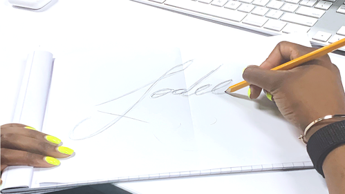
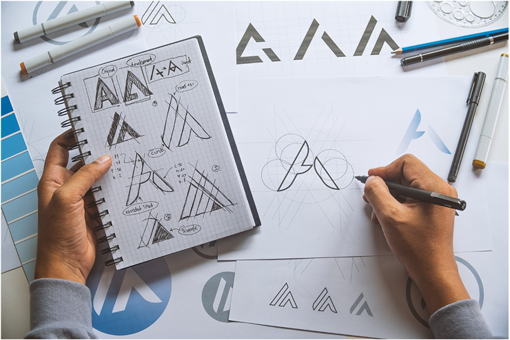
Before you head to the computer to finalize the design, it’s helpful to start drawing on paper. Starting out with some preliminary sketching is a good way to put a variety of ideas on paper. That way, you can get mistakes out of the way and start riffing on different variations and concepts. If you rush and skip this step, you likely won’t get the result that you want. When you look at something on paper, you can get a perspective that you lose on a computer. Sometimes the original ideas will go through five or six revisions until you lock onto a concept you like
 .
.
Color theory is complex, and logo colors evoke specific meanings and moods. Logos must look good in black and white and grayscale before you embark on using color. Using black and white first will help you simplify things and keep the logo neat. It helps avoid creating overcomplicated, disjointed messes that don’t scale down to small materials like business cards. Starting with black is a practical decision. On some materials, you might be required to use the back version of a logo – for instance, on invoices or anywhere a black-and-white printer is used. Once you’ve mastered perfecting a black-and-white logo, then you can move on to colors.

The job of a successful logo is to be noticed, but there’s something to be said about simplicity. In fact, the simplest of logos tend to stand out the most. (Think about Target’s double circle or FedEx’s hidden arrow.) “It’s important to have a balanced combination of simple and quirky — you want your logo to be interesting, but you don’t want someone to have to sit and stare, analyzing the logo,” according to tech resource site, Mashable.
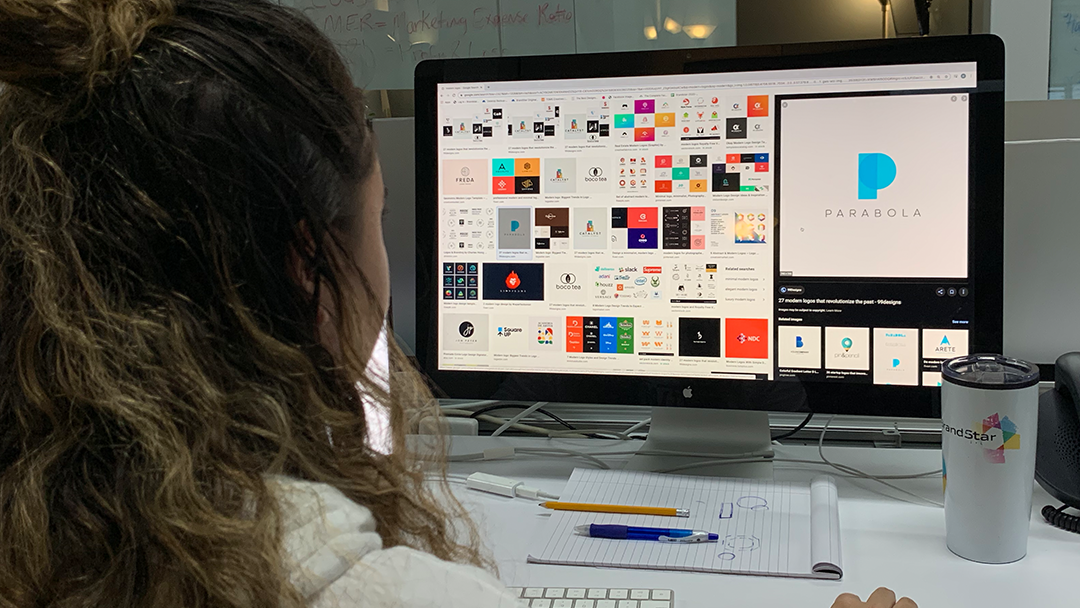
Before finalizing a logo, market testing is essential. Make sure no other brand has a similar look, whether it’s a competitor or a business in a different sector. Then, see how your current customers or clients react, as well as specific groups you’re interested in targeting in the market. If feedback is mixed, don’t feel defeated: Go back to the drawing board and tweak the logo. In the long run, this will ensure success. Pro tip: One way to test various logo designs is to put out a survey on a service such as Amazon’s Mechanical Turk or SurveyMonkey.
However, what do the most iconic logos all have in common? “If you look at how they originated, you see that they derived from a great understanding of brand principles. Nike designer Carolyn Davidson was told to create something that displayed motion and would look good on a shoe—hence, the swoosh; Audi represents the company’s four marques linked together; Puma, a simple visualization of the name, along with a leaping puma,” according to Mashable.
Doing plenty of preliminary work, staying simple, and performing market testing—these are among the five steps to perfecting your next logo design and making sure your brand stands out from the crowd.